One common method of partitioning publicly traded companies is by size. Companies are often times segmented by their total market capitalization (market cap). The market cap is calculated by multiplying the total number of shares outstanding by the stock’s market price. While companies can be split into any number of bins, typical groupings include (from smallest to largest); micro, small, mid, large and mega cap.
Three popular indexes to track the performance of domestic companies include the Russell 3000, Russell 1000 and Russell 2000.
- “Total Market“: The Russell 3000 index measures the performance of the largest 3,000 U.S. companies, representing approximately 98% of the investable U.S. equity market.
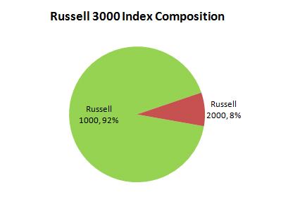
- Large-Cap: The Russell 1000 index measure the performance of 1,000 of the largest public companies in the United States. It represents approximately 92% of the Russell 3000 index. The median market cap in the Russell 1000 as of April 30, 2011 was $5.955 billion. The largest individual company included had a market cap of $448.499 billion.
- Small-Cap: The Russell 2000 index measures the performance of approximately 2,000 small, publicly traded companies in the United States. The Russell 2000 represents about 8% of the Russell 3000 index. The median market cap in the Russell 2000 as of April 30, 2011 was $570 million. The largest individual company included had a market cap of $5.956 billion.

Source: Russell Investments
One way to measure the relative performance of domestic small and large cap stocks is to divide the price of the Russell 2000 index by the price of the Russell 1000 index. In the chart below when the blue line is declining, large cap stocks, as measured by the Russell 1000 were outperforming small cap stocks, as measured by the Russell 2000. This was generally the trend from the middle of 1993 until some time in 1999. Since 1999, however, small cap stocks have outperformed large cap stocks. This is evidenced by the upwardly slopping blue line.
During trending periods of either out-performance by large or small cap stocks, calculating the deviation from the average ratio can be informative. In the chart below the gray shaded region, bounded by the dark green and orange lines, represents one standard deviation from the mean ratio of 0.913. Approximately 66% of the time since the end of 1992 the small to large cap ratio fell within this region. Relaxing the deviation from the mean to two standard deviations from the mean results in the area between the bright green line and the red line. About 95% of the time the small to large cap ratio has been between this defined range. Today the ratio of small cap performance relative to large cap performance is approaching upper half of the two standard deviation range.
As each day passes the mean ratio is slightly impacted by new data. The longer the time series the less impact that the new data has on the mean. To say today whether or not small caps can continue to outperform large caps is hard to say. It is possible that small caps will continue to outperform, however, as the past 20 years of data illustrates this trend can reverse.
Small to Large Cap Ratio (December 1992 to May 2011)
