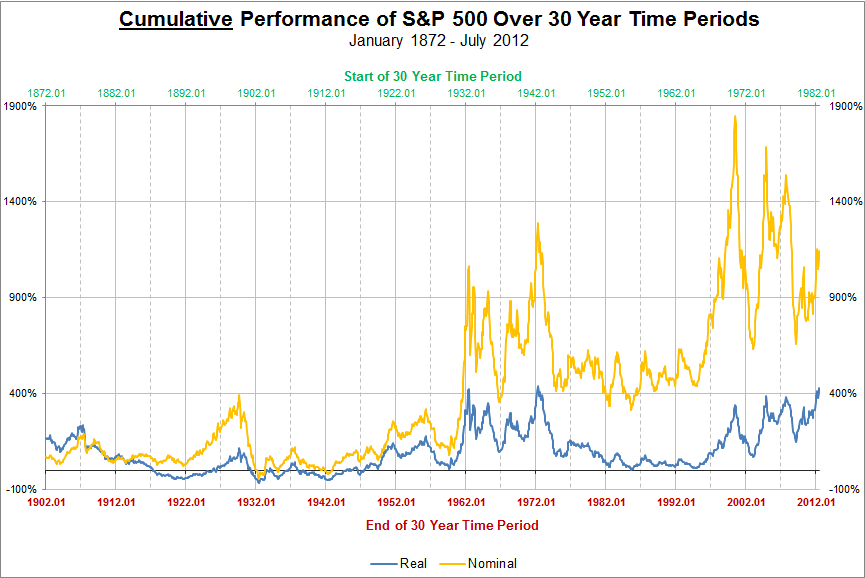
From July 1982 to July 2012 the price of the S&P 500, a U.S. large company stock index, rose from 109.40 to 1,359.78. This 1,250.38 point increase represents a cumulative 1,143% gain over the thirty year span. While this nominal price return is quite remarkable, it needs to be adjusted for inflation in order to represent the real change in consumer purchasing power terms. Once adjusted for consumer price inflation the real price return comes in at, a still healthy, 428%.
In the first chart the cumulative nominal (before inflation) and real (after adjusting for inflation) price performance for all 30 year periods since 1872 are displayed. The top axis, in green, represents the start of any one 30 year period and the text directly below it, in red, represents the end of the corresponding 30 year period. For example, for the 30 year period from 1942.01 (Jan. 1942) to 1972.01 (Jan. 1972), the nominal return was 1,056% and the real return was 342%.
Click on the chart below for a larger view
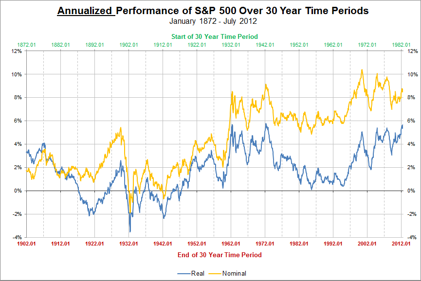
Large cumulative figures can be a bit disorienting, so the second chart has annualized 30 year returns. For example, for the 30 year period from 1942.01 (Jan. 1942) to 1972.01 (Jan. 1972), the nominal return was 8.5% per year and the real return was 5.1% per year.
Over the most recent 30 years, July 1982 to July 2012 the annualized nominal return for the S&P 500 was 8.8%, while the real return was 5.7%.
Click on the chart below for a larger view
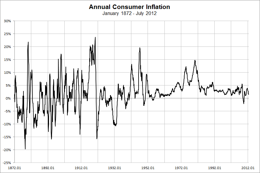
A few curious results appear when comparing all 30 year periods since 1872. For all 30 year spans beginning with 1872 to 1902 and ending with 1877 to 1907 the real return on the index was higher than the nominal return. This was due to consumer deflation during the Long Depression that gripped the world throughout the last quarter of the 19th century. Deflation, in the U.S., has been a rare occurance since the 1940s. The only time in recent history that the index of consumer goods fell in price year over year was during the recent Great Recession.
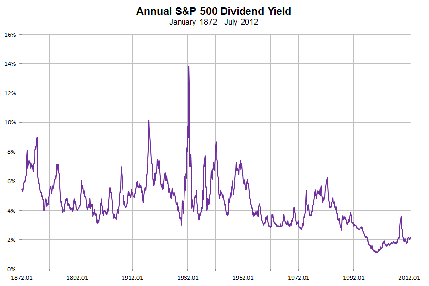
The second interesting result from mapping all 30 year returns since 1872 is the difference in the price returns pre-1960 and post-1960. While price returns are much higher after 1960, the returns from the charts above do not take into account the impact of dividends. Prior to the 1960s the annual dividend yield on the S&P 500 was typically between 4% and 6% per year. From 1960 to 1973 the dividend yield was just over 3%. Since 2000 the S&P 500 dividend yield has hovered around 2%. The higher dividend dollars received during the first half of last century would have increased the total return of the S&P 500 index more than the dividends of the past few decades.
Data Source: Market Volatility, Robert Shiller


