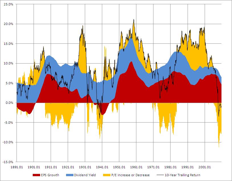
Using stock market data from Robert Shiller below is an illustration that charts the rolling 10-year annualized total return (black line) from January 1891 to September 2010 for the domestic equity market. A total return includes both price change and the dividend yield. Any point on the black line represents the annualized total return over the previous ten years. For example, as of January 2000, the annualized total return from January 1990 to January 2000 was 18.2%. How was this achieved?
The areas of color represent the three components of the total return; normalized* earnings per share (EPS) growth, dividend yield and the change in the Price to Earnings (P/E) ratio. The P/E ratio is also known as an earnings multiple and represents the ratio of the price that an investor is willing to pay for a dollars worth of earnings. At any point in time, the three components sum to the total return. As of January 2000 normalized EPS growth contributed 6.0 % of the 18.2% 10-year annualized total return, the dividend yield 2.8% and the change in the P/E ratio 9.4%.
As evidenced in the graph, earnings growth has been primarily positive. The two exceptions, where earnings detracted from the total return, were during the last two depressions in the United States; the 1890s and 1930s. The contribution of the dividend yield peaked at 6.9% and bottomed at 1.6% over the past 119 years . The earnings multiple (P/E ratio) has been the most volatile component of 10-year annualized returns. It has added to the total return around nearly 60% of the time and detracted from the total return just under 40%.
Click the image for a larger view

*The earnings per share data was normalized by averaging the previous ten years of earnings.